Banner-----Dashboard

Data Dashboard

The EWS-KT data dashboard allows us to transparently share our data, which is collected by staff in the field and reported through our specialized KT app.

  • How many farmers did we train last year in Uganda?
  • What crops are being grown by demonstration farmers in India?
  • What is the average cost for agricultural inputs for a cucumber crop in Cambodia, and what is the return on investment?

Find the answers to these questions and more in our data dashboard.

data dashboard on laptop screen

Using the Data Dashboard

main page, global, top


Farmers & Training

At the top of the dashboard, see data about the farmers we work with, the activities we do, and farmers’ average net profit per crop cycle. Look at current global results, or select a country and year and click Go.

main page, global, middle


Interactive Map

Click on the map’s colored circles to see where we work. Zoom in for greater detail. At the most focused level, you can click through to see each demonstration plot’s crop, yield, and financial details.

YLB in Cambodia 2023 overview


Demo Crops

In the Crops section below the map, select the crop you’re interested in. On the next screen, view the geographical distribution of demo plots for that crop, or select a country to access average country-specific costs, returns, yield, and more.

Nigeria 2024 demo plot map & crops


Country Results

Select the country and year at the top of the page, and click Go. You’ll see information on the farmers trained, activities completed, and average net profit. Scroll down to look at the country’s demo plots on the map, or select a crop to see country-specific demo crop results.

Tanzania demo ROI page


Demo Details

On country or global pages, click on the number below “Demonstration Plots” or “Completed Demos” to access the list of demo plots for that page. Then click on View Demo to see costs, returns, inputs, and productivity for individual demo plots.

How Do We Use the Dashboard at EWS-KT?

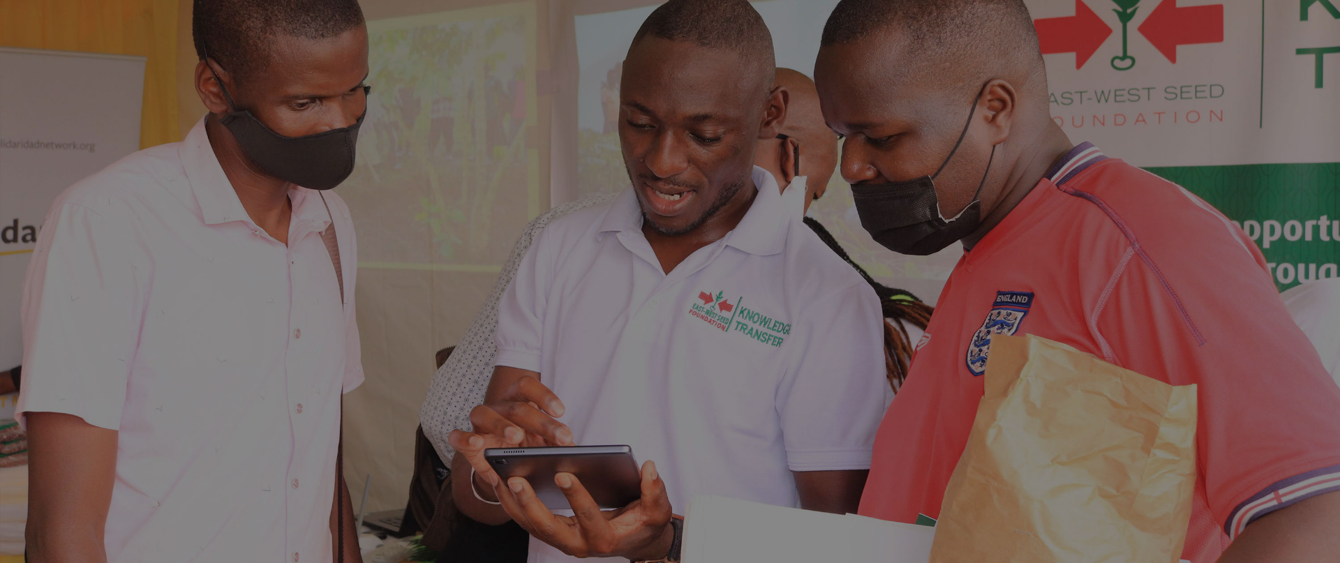
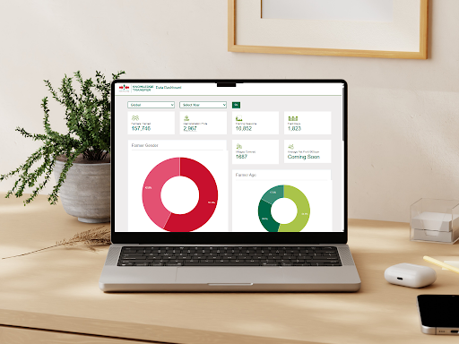
EWS-KT staff at all levels use the dashboard to analyze the collected data and make informed decisions. We can assess the variance in cost and returns and in farming practices and tune our recommendations to fit the context on the ground. With all the demonstration farms in each country plotted on the dashboard’s map, we can easily see where we have clusters of farmers and build sustainable sharing systems.

The dashboard also enables our farming technical support hub to monitor and evaluate results and take action. In addition, it allows managers and project coordinators to produce tailored reports on country activities.

This dynamic data system is being continuously refined and improved. In the future, we are planning to bring into the dashboard other EWS-KT databases, such as baseline, evaluation, and quick impact studies, as well as survey results.

people using the KT app to record data